BRISmart Revamping the Homepage

Introduction
BRISmart is a digital services provided by Bank Rakyat Indonesia (BRI), one of the largest bank in Indonesia. The service focuses educational technology (edtech) platform that provides a wide range of learning services and educational content.
It primarily focuses on professional development. The platform aims to help internal employee to improve or increase their professional performance skills and prepare for exams through various online tools and resources.
There are 2 user type on this product services :
- Learner from Internal Employee
- Lecturer or Educator from Internal or External Sources
Responsible
As a pivotal member of the design team, My responsibility is to crafting the Product and Prototypes then share the conceptualize ideas, gain alignment, and drive decision. Making continually communicate with stakeholders to update the progress also be proactive in seeking feedback.
My role is to ensure that every design decision is data-driven, user-focused, and aligned with our business goals.
Goals
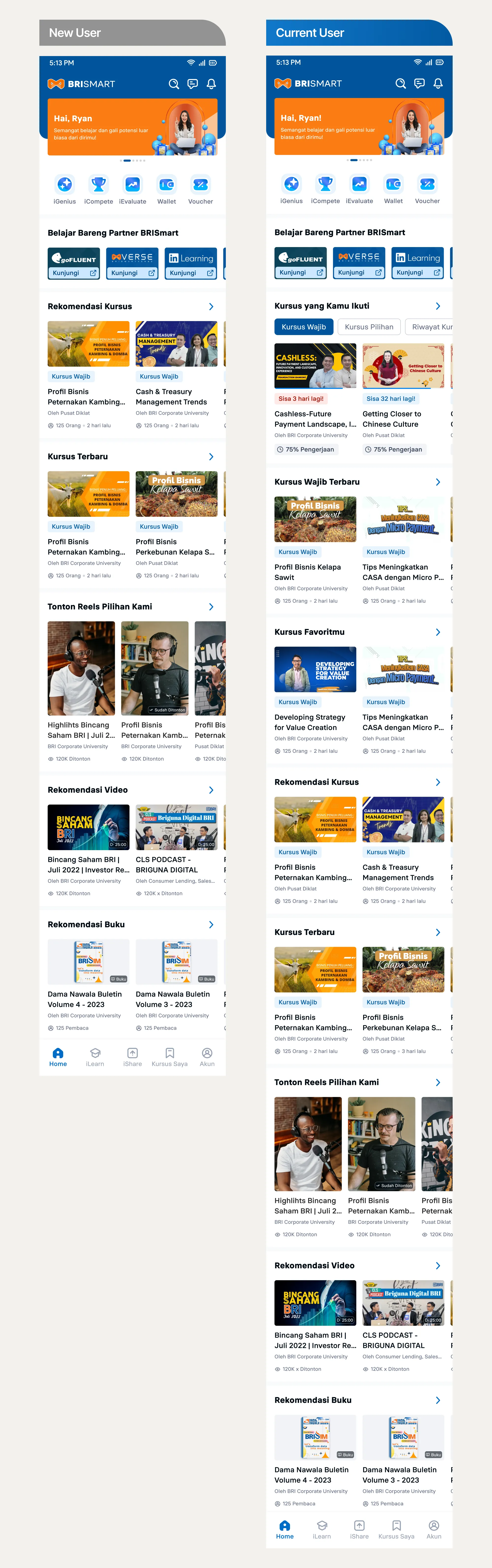
The primary goal to redesign Homepage of BRISmart in a way that simplifying way to encourages user retention, focusing on clarity and ease of use.
Educational Technology (edtech) becoming increasingly competitive, it was crucial that this redesign not only meets but exceeds the expectations of our users and business side, providing them with a services that powerful and easy to navigate.
Approach
My approach was methodical and user-centered. I’am initiated the project with an Conducted Usability Testing with stakeholders to identify pain points in key feature on Homepage. Also doing Heuristic Evaluation Methodology to Analyzed existing production apps to identify UI/UX pain points, documenting my findings to understand and identify opportunities for innovation.
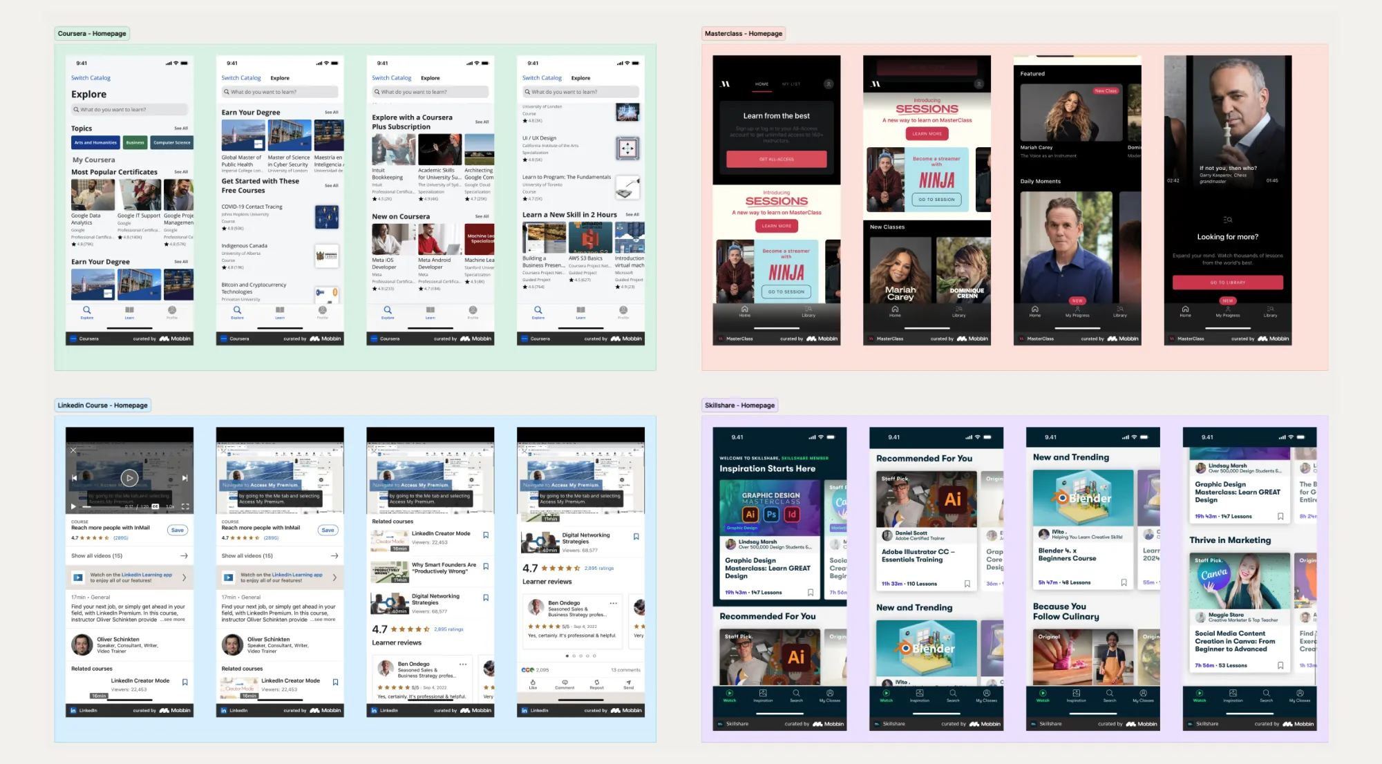
Also we initiated the project with an in-depth competitor benchmarking analysis. This documentation included screenshots and feature comparisons which served as a critical foundation for our design strategy.
Design Process
The redesign aimed to increase user retention by improving the user journey, ensuring seamless navigation, and increase user satisfaction.
A. Doing Heuristic Evaluation and Ideation
This step was to explore pain points and Analyzed existing production apps, documenting my findings to understand and identifying the problem. Also Benchmark against product competitors.
Apart from that, we also held direct discussions and brainstorming with stakeholders to conduct usability testing.
B. Solution Prioritization
After doing Ideation, I did conceptualization and analysis with a list of solutions that I had obtained. Next, from the solutions I got, I gave each solution a priority level so that it could be applied at the design implementation stage.
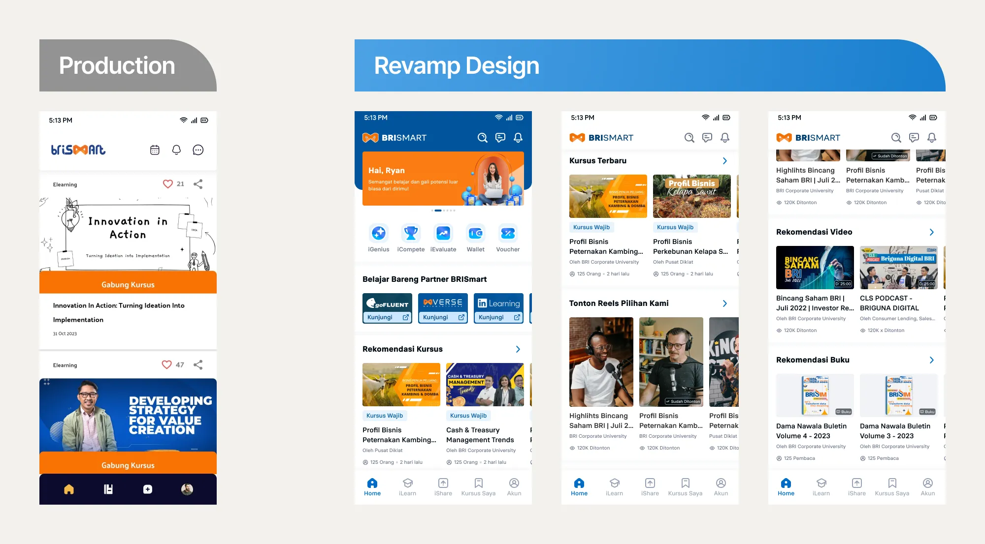
C. Implementation
This step crafts the Hi-Fi design and also clearly designs flow the that will be improved on the Homepage.
D. Review and Present to Stakeholders
At this step, I present the results of design and flow improvements to stakeholders and gather feedback from them. Also a discussions regarding whether the design solution that I proposed can be implemented.
E. Iteration
At this step I adjust the design if there is feedback from stakeholders or from user after doing conduct UT, if the design adjustment complete I review and present it back to stakeholders and users.
F. Conduct User Testing
After preparing a product redesign and gather input from stakeholders, I’am with UX Researcher also making a plans and conduct user testing on product improvements that I had approached and focused on flow would i improved most.
Design Solution
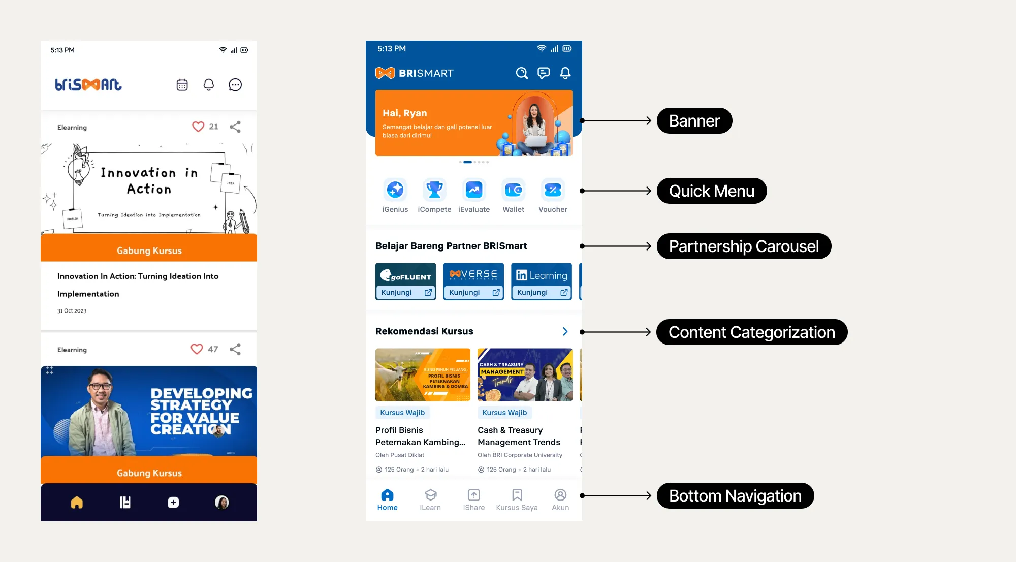
Banner
My approach on the banner is doing collaborated with marketing team, we defining the banner type in homepage into 2 type of banner Product Information Banner & Promotional Banner.
We discussed with our Stakeholders they need the Product Information Banner to present BRISmart ongoing event or feature introduction, and Promotional Banner it will be present to upcoming or ongoing benefits or reward to user.
Quick Menu
On the quick menu section we doing added the Additional support or Gamification menu easier to find for our users. From a business and product perspective, this strategy aims to increase user retention and user engagement to our product.
Partnership Carousel
On Partnership Carousel section we doing discussed with our Stakeholders they need the list of external Partnership business showed on the BRISmart product. Basically user can dive into our product partner to making an options to our users they can learning on other platform.
Content Carousel
We’re doing restructuring content and classes separated by categories to make users more accessibility and easier options on the content provided, Also we improve the information hierarchy in each class to provide the value and purpose of the class itself to attract user interest in joining a class.
Also we’re doing restructured Content Carousel hierarchy based on business needs and best practice to bring more impact on business value and awareness.
Bottom Navigation
My approach to bottom navigation is to add context to each menu icon to make the information on the main menu clearer to the user. avoids users guessing the available menus whose information is only based on icons.